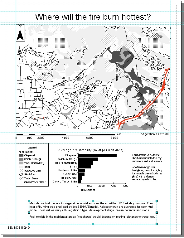
Lab 4: Summarizing fields, making graphs, and assembling a layout
A map is good for showing what is next to what, and for showing contrast
between neighbors. But it's hard to tell from a map whether one region
is, for example, twice as dark as another. A graph can complement the map,
making the quantitative values visible. I'll arrange the map together with
its graph on a page layout, along with other accessories such as a legend.
This lab took a huge amount of time for various reasons:
-
ArcMap's graphing is awkward and hard to use, especially trying to change
the marker colors and trying to control the order of categories in a bar
graph. The help screens often produce errors and crash the program, and
the other documentation under C:\arcgis\Digital_Books 8p3 didn't answer
my questions. I had to do a lot of tedious trial and error to understand
the different options.
-
The Data
Dictionary supplied to us didn't include all of the layers and didn't
explain what a lot of the categories meant. For example, it didn't explain
why the "roads" layer was different from "streets", and which field might
represent the size of a road. (I finally figured this out after a lot of
web searching and examining the different fields.)
-
There seem to be some errors in the data, such as missing values of HA;
see discussion below. It took some experimentation to deal with these records.
-
Mainly, it takes a lot of exploration to decide what the data mean and
how to represent it best. Which fields have meaningful correlation with
each other? How many different categories can be symbolized on a map before
it becomes unreadable? How should data be summarized: display the maximum
and minimum, or the standard deviation, or just the average? I spent a
lot of time trying out different answers to these questions. (It would
probably have helped if I'd read the background
on the fire model first before diving into the database.)
1. Summarizing a field
I'll look at the wildland vegetation layer and the Fuel Model field, which
is a set of standard classes developed by the Forest Service's Northern
Forest Fire Laboratory. (These classes describe only the wildlands; the
developed areas are recorded as "Residential" or "No Fuel Model".) The
Fuel Model is one of the inputs to the BEHAVE computer model:
| BEHAVE inputs |
BEHAVE outputs |
-
vegetation type
-
fuel model
-
development stage
-
crown potential
-
tree height
-
slope class
-
weather conditions (wind, temperature, moisture)
|
-
rate of spread
-
flame length
-
fire intensity (heat per area)
-
crown potential
|
I'll concentrate on fire intensity, which is the field called HSUBA ("H-sub-A",
HA, heat per unit area) in the attribute table, by summarizing
the fire intensity for each of the fuel models that occur in the study
area. Summarizing will mean losing the details of what BEHAVE calculated
for each polygon, but we can't display all the exact values on a map anyway,
since they would have to be represented by just a few discrete colors.
I wanted to know how much the data varied within each Fuel Model, so I
requested average, maximum and minimum values of HSUBA. However, some of
the minimum values seemed suspiciously low; it turned out that (as seen
by sorting on HSUBA) four polygons have HSUBA recorded as 0, which seems
wrong; it must be missing data for some reason.

I decided to eliminate these polygons, as well as the Residential polygons
which weren't covered by the BEHAVE calculation, by selecting only records
with HSUBA > 0, and re-doing the Summarize request with the box checked
to summarize only on the selected records.
(Note to myself: when re-opening a map, look for the summary tables
in the Source tab of the map table of contents, not the Display tab.)
2. Making a graph
It took some exploration before I understood the different options for
graphs. This simple
tutorial
from Statistics Canada discusses some appropriate, and inappropriate,
uses of different types of graphs.
At first I wanted to visualize not just the average of the data, but
also its range. A high-low-close graph seemed ideal for this, but it can
only be made with a horizontal x-axis, which doesn't leave enough room
to show the names of the fuel models. The only way to show the category
names is to use one of the horizontal bar graphs. I tried graphing the
maximum, mean and minimum:
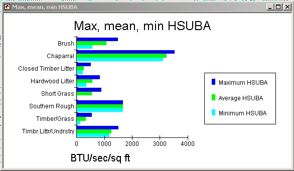
I finally decided that this was too complex, and the maximum, mean
and minimum were all fairly close together anyway, except for some of the
lower heat categories. The important information to communicate is that
Chaparral is way above all the others, with twice as much heat as Southern
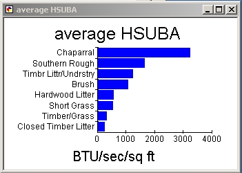
Rough in second place. Therefore, I decided to show only the average, and
to focus attention on the larger averages with a Pareto (i.e., sorted)
bar graph:
Meanwhile, what should be on the map? It's hard to distinguish eight
different kinds of area using only black and white! I decided to focus
attention on the top four categories by using shades of gray, and to represent
the others using various kinds of hatching from the symbol menu. The polygon
borders were set to no color to make the map less complicated to look at.
(It would be nice to match the colors of the bars on the graph to the symbology
on the map, but the dialog box for selecting marker colors is extremely
tedious to use; it claims that patterns can be applied to bars, but they
don't appear.) I re-ordered the Fuel Model categories in the Symbology
tab so they matched the order in the bar graph.
Finally, I think it needs some street names as familiar landmarks to
orient the reader. I have to use the "streets" layer from the Census, even
though it has less positional accuracy than the "roads" layer from the
USGS 7.5' Quadrangles, because it's the only one that has street names.
It will be more recognizable if major roads are thicker, so I symbolized
the streets according to their CFCC (Census
Feature Class Code), using standard symbols for highways and residential
streets from the menu. I don't want to label all the streets, just
a few important ones, so on the Labels tab of the Layer Properties dialog,
I selected "Method: Define classes of features and label each class differently",
and constructed a query to select the names of streets I thought were familiar.

Also, adding a "halo" to the labels (under Text Symbol, click Symbol...)
makes them more readable when they fall on top of other lines or dark patches.
3. Assembling the layout
The map will go on the top half of a portrait page, with the graph, legend,
etc. below. (Another option would be to use a landscape page and cover
most of it with the map, and have the graph as an inset in the southwest
corner, but I decided that wouldn't look as clean.) I put in some guide
lines and turned on Snap to Guides to make everything sit neatly. Some
final touches to the layout:
-
Zoomed the map so the features fill the visible area, to get rid of extra
white space so the map can be as large as possible on the layout.
-
Added definitions of "chaparral" and "southern rough" in a text box (I
didn't know what they were before looking them up, so maybe the reader
doesn't either). Another text box gives some general explanation of what
to look for in the map.
-
Added a note on the date of the map: the vegetation polygons were delineated
from aerial photographs in 1993. The front lines in the war against
our enemy, eucalyptus, may have shifted. As of October 2005, the
university continues to fight.
Here's the final layout!