Nakahira vs. Vadim, and a Bit About Composition in General
I accidentally created an interesting double bill when I attended back-to-back screenings at MOMA of Yasushi Nakahira’s 1956 Kurutta kajitsu (Crazed Fruit, aka Juvenile Passion) and Roger Vadim’s 1959 Les Liaisons dangereuses. Both Nakahira and Vadim were championed in the mid to late 50s by the Cahiers du Cinema critics, who used them as sticks to beat the mainstream French cinema for its stiffness and orthodoxy. And both directors enjoyed only a brief period of critical favor: Nakahira never made another splash in the West, and Vadim quickly alienated the affections of Cahiers and its followers.
(The historically appropriate pairing of these films isn’t pure coincidence. The Cahiers critics of the time seemed to take a special interest in films about youth: possibly because the subject matter encouraged a freer directorial style; possibly also because the Cahiers writers were young themselves and trying to foment a revolution. The Nakahira and Vadim films were both part of MOMA’s Jazz Score series – and jazz music and youth subjects went hand in hand in films of the 50s.)
Truffaut, whose review of Kurutta kajitsu was compiled and translated into English in My Life and My Films, made the connection between Nakahira and Vadim:
"In short, you will have guessed, Ishihara (Editor’s note: screenwriter Shintarô Ishihara, the central literary figure of Japan’s 50s “taiyozoku” youth culture) is called in Poland the Marek Hlasko of Japan, and in France the Sagan/Vadim/Buffet of Japan. The second is certainly warranted, since it seems clear that Juvenile Passion was influenced by And God Created Woman (Et Dieu...créa la femme), which played in Japan at the same time it was released in France.
"As in Vadim’s first film, we are shown two brothers who are successively the lovers of a young woman unhappily married to an American. I find the Japanese film superior to its French model from every point of view: script, direction, acting, spirit."
The Cahiers writers would always define Vadim by Et Dieu...créa la femme, which fascinated them upon its 1956 release, and seemed to them to point the way toward a new and freer cinema. It’s not the Vadim film that appeals to me most. Still, I think Vadim’s now-depressed reputation deserves a lift, and I certainly thought he got the better of Nakahira in that evening’s faceoff at MOMA.
One of the appeals of Kurutta kajitsu is that the characters are rebellious enough to confound certain genre expectations. The enigmatic female lead (Mie Kitahara, seen in NYC recently in Tomu Uchida’s memorable Jibun no ana no nakade [A Hole of My Own Making]) plays a triple game as wife, innocent, and slut, but is not typed as duplicitous: the film suggests that her desires are sincere in each compartment of her life. And the older brother (Yûjirô Ishihara) betrays his sibling, not from malevolence or weakness, but from impulsiveness wedded to a reckless existentialism. Director Nakahira makes unusual and vigorous attempts to convey the subjective experiences of the characters, using point-of-view shots and focusing on small-scale events to associate the boys’ lives with immediacy and sensation.
Still, Nakahira strikes me as stronger on big concepts than on moment-by-moment direction. Too often his performers fall back on conventional signposting within each scene, even when the characters don’t reduce to simple concepts. (Chabrol corrected this shortcoming in 1959’s Les Cousins, which could be seen as a loose reworking of Kurutta kajitsu.) And I don’t find Nakahira a visually expressive director: he manages a number of attractive shots, mostly in exteriors, but produces unremarkable results with basic tasks like cutting between characters or laying out simple action.
The simple scenes in Les Liaisons dangereuses are exactly where Vadim establishes his talent. His compositions and camera movements have great natural beauty, and also preserve a balance between subjectivity and an objective, environmental perspective. The now-familiar source material (I haven’t read Laclos’ novel, but I feel as if I have after seeing at least four adaptations of it) opens an intriguing gap between the malevolence of the protagonists and their more conventional sentimental aspirations, and Vadim and his writer Roger Vailland are intuitive enough to enhance the emotional gravity that accompanies the characters’ nasty gamesmanship. The best example of this approach is the stunning scene in which Valmont (Gérard Philipe) presses his courtship of the chaste Marianne (Annette Vadim) while they walk amid snowy mountains at a winter resort. Valmont’s seduction strategy, described in voiceover, is to tell Marianne the truth about his life of depravity; and so the scene plays with a built-in dual perspective, according to which Valmont makes both a calculating power play and a naked confession to a woman who is already more than just a victim to him. Vadim plays the scene for maximum solemnity, letting Valmont’s words resonate in the majestic spaces that shift behind the characters, and keeping his camera a little low and far enough away from the couple that their figures never completely eclipse the elemental environment.
Throughout the film, Vadim’s innate seriousness makes it possible for him to give the cruelty of the subject matter its full weight, neither softening it (cf. the Forman/Carrière and Kumble versions of the story) nor implicating himself in it (cf. the Frears/Hampton version). This is not to deny a certain number of missteps, mostly near the ending, possibly attributable to internal or external censorship. One can see Vadim as divided between a fruitful iconoclasm and a more conventional or conformist tendency. (If film criticism has tended to regard Vadim as the cinema’s answer to Hugh Hefner…well, Hefner too is half revolutionary and half conformist, and his career declined in the same precipitous fashion.)
Before I insert images into this blog for the first time, I’m going to make a tentative attempt to generalize some of the above comments about composition. When I watch a movie and think, “These images are intrinsically beautiful – this director really knows how to compose,” and then try to analyze the visual style, I often conclude that the compositions are balanced between two functions: showing the figure in the foreground, and showing the world. The balance is always managed in such a way that the shot can still function in the mind of the viewer as a depiction of the foreground figure; and yet the room or landscape is presented with some spatial integrity.
And every time I watch a movie and think, “These images are dull and conventional,” I conclude upon further analysis that the compositions are framed as if they are trying to present only one object, or one idea, and that the image reduces in my mind to a concept. Closeups are composed to show the person and not much else; longer shots are far enough back that the relation of the object or person to the surroundings seems to motivate the composition. I don’t necessarily think that shots that fit this description are a liability, but they miss out on intrinsic beauty, because they suggest a concept too strongly. In some cases shots like these gain value from being part of a larger artistic structure.
I was first put onto this train of thought when I attended another circumstantial double bill at MOMA of Mankiewicz’s House of Strangers and Fregonese’s Black Tuesday. I felt as the films had utterly different visual agendas: it seemed to me that every shot in the Mankiewicz film had a single concept behind it, and could be translated into words without loss; and that every shot in the Fregonese film was a picture of the world, with its complexity preserved.
I don’t have DVDs of Kurutta kajitsu or Les Liaisons dangereuses, so I’ll compare still images from the films that I found on YouTube. From the very limited selection of clips available, I chose two fairly unremarkable interior scenes: a teen party from Kurutta kajitsu in which the representatives of reckless youth state their credo; and the culmination of Valmont’s attempt to seduce Marianne in Les Liaisons dangereuses. The scenes have different emotional trajectories (not to mention different aspect ratios) and therefore don’t compare perfectly, but they do give a sense of Nakahira and Vadim’s compositional tendencies.
Let’s compare two-shots first. The Nakahira scene is heavy on closeups, but it contains a few two-shots:
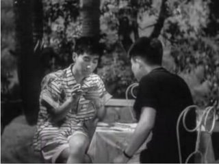
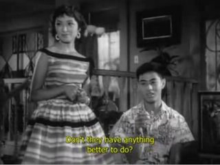
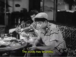
The lack of compositional tension in the shots can partly be chalked up to the emotionally neutral content of the scene: none of the characters in these two-shots have a strong personal relationship to each other. Nonetheless, the layout of these shots has a cerebral quality to me: the two figures in the frame are just large enough that the frame seems to be about them and little else. The background is visible in the shots, and even has some visual appeal in the second shot; but for me the size of the people in the frame sends a signal that the background isn’t motivating the placement of the camera.
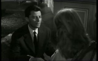
The Vadim clip is longer, so it provides more varied examples. And the emotional tension between Valmont and Marianne is at a high point, which to some extent mandates additional diagonal tension. Here are a few two-shots in this scene that are relatively free of diagonal tension, and therefore compare better to Nakahira’s two-shots:
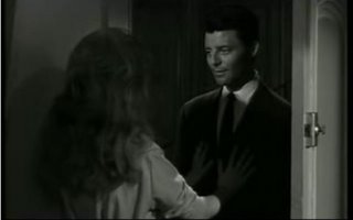
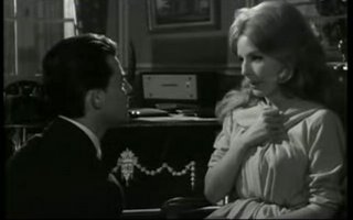
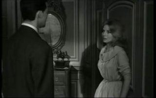
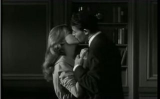
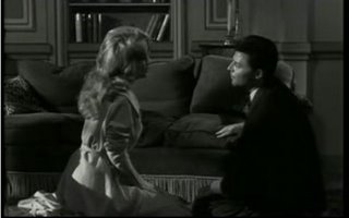
Allowing for the wider aspect ratio that Vadim uses, and also for Vadim’s use of deep focus, these shots aren’t wildly different from Nakahira’s. (The deep focus is, of course, not irrelevant to this discussion: it’s certainly an invitation to experience the characters as part of the environment. I don’t know much about Vadim’s director of photography here, Marcel Grignon. He seems to have had a long career in the European film industry, but I recognize only a few of his credits, principally Clement’s Paris brûle-t-il? and Borowczyk’s La Bête. He worked with Vadim once again, in 1963 on Le Vice et la vertu.) I perceive a greater tendency in Vadim to arrange his actors to create a sort of human terrain, a landscape with perspective and contour.
Other two-shots in the scene make greater use of distance and diagonality:
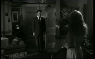
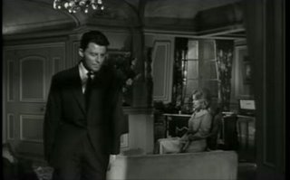
Here we see an interest in the environment that doesn’t have a parallel in the Nakahira scene. The deep focus in these shots is clearly part of a plan to photograph the texture and the space in the room, while configuring the actors in dramatic opposition to each other. There is very little in the story that draws our attention to the setting: Vadim could easily have conceived the scene as an abstract personal confrontation, but he seems to think naturally in terms of topography.
Finally, a few closer two-shots drive home the idea of actors as terrain:
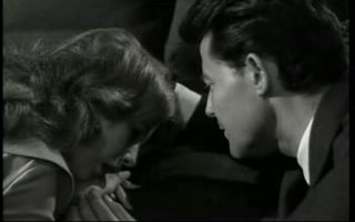
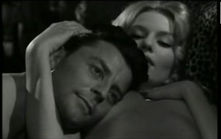
There is not much in the way of background in these shots, but the people are invested with spatial qualities of their own. I often thought of mid-period Antonioni when watching Les Liaisons dangereuses; it didn’t occur to me until afterwards that the film was released nine months before L’avventura, the film that popularized Antonioni’s wide-screen compositional style.
Now for one-shots. The scene I’ve chosen from Kurutta kajitsu centers on a Soviet-inspired montage sequence that cuts among a number of tight closeups, usually with tilted compositions:
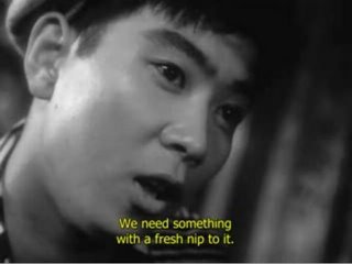
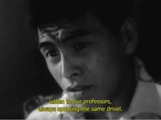
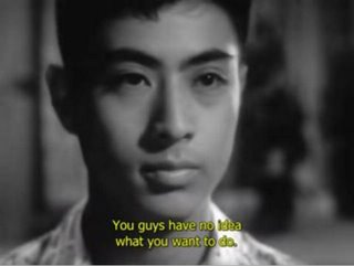
The composition that isn’t tilted is the closeup of the straight-arrow brother, whereas the tilted closeups go to the “taiyozoku.” This correspondence between composition and characterization is way too blatant to have any resonance for me.
The scene contains a few one-shots that are more conventional:
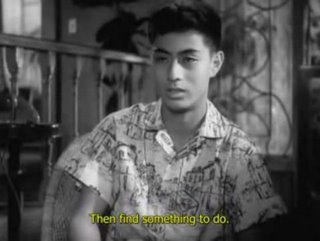
Again, Nakahira frames simply, with no apparent intention other than to show the actor. There is some visual tension in the background with the wooden railing; the direct framing of the boy again discourages me from registering him in his environmental context.
Vadim’s simplest one-shots aren’t much more complicated:
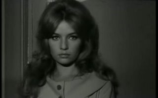
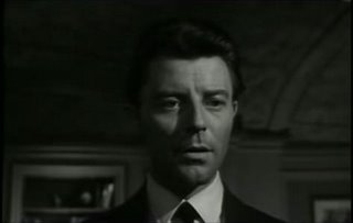
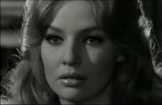
Most of the added environmental presence can be chalked up to the wider aspect ratio and the use of deep focus. Often, however, Vadim clearly shows a desire to situate the characters amid their decor, even with the limited amount of screen acreage available to show background in one-shots:
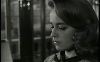
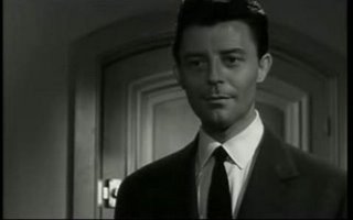
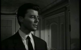
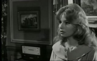
The wider aspect ratio gives Vadim greater opportunity to place actors off-center and highlight the décor, Antonioni-style.
As with the two-shots cited earlier, some of the one-shots strongly suggest the topographical qualities of the bodies of the actors:
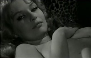
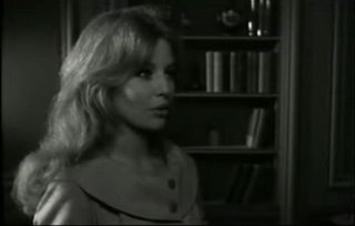
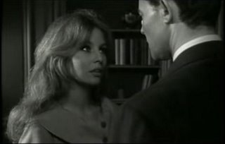
At one point, Vadim creates an off-center composition around Marianne, then moves Valmont into the frame for a more massed, topographical effect. Practically the same framing serves both halves of the shot, which suggests that Vadim’s compositions are friendly to the absence of the actors as well as their presence.
I haven’t seen Vadim’s 1957 Sait-on jamais... (No Sun in Venice), but it's often cited as one of Vadim's best (Godard reviewed it favorably in Cahiers), and it screens at MOMA in the Jazz Score series on Monday, June 16 at 6 pm and Wednesday, June 18 at 6:45 pm.
(The historically appropriate pairing of these films isn’t pure coincidence. The Cahiers critics of the time seemed to take a special interest in films about youth: possibly because the subject matter encouraged a freer directorial style; possibly also because the Cahiers writers were young themselves and trying to foment a revolution. The Nakahira and Vadim films were both part of MOMA’s Jazz Score series – and jazz music and youth subjects went hand in hand in films of the 50s.)
Truffaut, whose review of Kurutta kajitsu was compiled and translated into English in My Life and My Films, made the connection between Nakahira and Vadim:
"In short, you will have guessed, Ishihara (Editor’s note: screenwriter Shintarô Ishihara, the central literary figure of Japan’s 50s “taiyozoku” youth culture) is called in Poland the Marek Hlasko of Japan, and in France the Sagan/Vadim/Buffet of Japan. The second is certainly warranted, since it seems clear that Juvenile Passion was influenced by And God Created Woman (Et Dieu...créa la femme), which played in Japan at the same time it was released in France.
"As in Vadim’s first film, we are shown two brothers who are successively the lovers of a young woman unhappily married to an American. I find the Japanese film superior to its French model from every point of view: script, direction, acting, spirit."
The Cahiers writers would always define Vadim by Et Dieu...créa la femme, which fascinated them upon its 1956 release, and seemed to them to point the way toward a new and freer cinema. It’s not the Vadim film that appeals to me most. Still, I think Vadim’s now-depressed reputation deserves a lift, and I certainly thought he got the better of Nakahira in that evening’s faceoff at MOMA.
One of the appeals of Kurutta kajitsu is that the characters are rebellious enough to confound certain genre expectations. The enigmatic female lead (Mie Kitahara, seen in NYC recently in Tomu Uchida’s memorable Jibun no ana no nakade [A Hole of My Own Making]) plays a triple game as wife, innocent, and slut, but is not typed as duplicitous: the film suggests that her desires are sincere in each compartment of her life. And the older brother (Yûjirô Ishihara) betrays his sibling, not from malevolence or weakness, but from impulsiveness wedded to a reckless existentialism. Director Nakahira makes unusual and vigorous attempts to convey the subjective experiences of the characters, using point-of-view shots and focusing on small-scale events to associate the boys’ lives with immediacy and sensation.
Still, Nakahira strikes me as stronger on big concepts than on moment-by-moment direction. Too often his performers fall back on conventional signposting within each scene, even when the characters don’t reduce to simple concepts. (Chabrol corrected this shortcoming in 1959’s Les Cousins, which could be seen as a loose reworking of Kurutta kajitsu.) And I don’t find Nakahira a visually expressive director: he manages a number of attractive shots, mostly in exteriors, but produces unremarkable results with basic tasks like cutting between characters or laying out simple action.
The simple scenes in Les Liaisons dangereuses are exactly where Vadim establishes his talent. His compositions and camera movements have great natural beauty, and also preserve a balance between subjectivity and an objective, environmental perspective. The now-familiar source material (I haven’t read Laclos’ novel, but I feel as if I have after seeing at least four adaptations of it) opens an intriguing gap between the malevolence of the protagonists and their more conventional sentimental aspirations, and Vadim and his writer Roger Vailland are intuitive enough to enhance the emotional gravity that accompanies the characters’ nasty gamesmanship. The best example of this approach is the stunning scene in which Valmont (Gérard Philipe) presses his courtship of the chaste Marianne (Annette Vadim) while they walk amid snowy mountains at a winter resort. Valmont’s seduction strategy, described in voiceover, is to tell Marianne the truth about his life of depravity; and so the scene plays with a built-in dual perspective, according to which Valmont makes both a calculating power play and a naked confession to a woman who is already more than just a victim to him. Vadim plays the scene for maximum solemnity, letting Valmont’s words resonate in the majestic spaces that shift behind the characters, and keeping his camera a little low and far enough away from the couple that their figures never completely eclipse the elemental environment.
Throughout the film, Vadim’s innate seriousness makes it possible for him to give the cruelty of the subject matter its full weight, neither softening it (cf. the Forman/Carrière and Kumble versions of the story) nor implicating himself in it (cf. the Frears/Hampton version). This is not to deny a certain number of missteps, mostly near the ending, possibly attributable to internal or external censorship. One can see Vadim as divided between a fruitful iconoclasm and a more conventional or conformist tendency. (If film criticism has tended to regard Vadim as the cinema’s answer to Hugh Hefner…well, Hefner too is half revolutionary and half conformist, and his career declined in the same precipitous fashion.)
Before I insert images into this blog for the first time, I’m going to make a tentative attempt to generalize some of the above comments about composition. When I watch a movie and think, “These images are intrinsically beautiful – this director really knows how to compose,” and then try to analyze the visual style, I often conclude that the compositions are balanced between two functions: showing the figure in the foreground, and showing the world. The balance is always managed in such a way that the shot can still function in the mind of the viewer as a depiction of the foreground figure; and yet the room or landscape is presented with some spatial integrity.
And every time I watch a movie and think, “These images are dull and conventional,” I conclude upon further analysis that the compositions are framed as if they are trying to present only one object, or one idea, and that the image reduces in my mind to a concept. Closeups are composed to show the person and not much else; longer shots are far enough back that the relation of the object or person to the surroundings seems to motivate the composition. I don’t necessarily think that shots that fit this description are a liability, but they miss out on intrinsic beauty, because they suggest a concept too strongly. In some cases shots like these gain value from being part of a larger artistic structure.
I was first put onto this train of thought when I attended another circumstantial double bill at MOMA of Mankiewicz’s House of Strangers and Fregonese’s Black Tuesday. I felt as the films had utterly different visual agendas: it seemed to me that every shot in the Mankiewicz film had a single concept behind it, and could be translated into words without loss; and that every shot in the Fregonese film was a picture of the world, with its complexity preserved.
I don’t have DVDs of Kurutta kajitsu or Les Liaisons dangereuses, so I’ll compare still images from the films that I found on YouTube. From the very limited selection of clips available, I chose two fairly unremarkable interior scenes: a teen party from Kurutta kajitsu in which the representatives of reckless youth state their credo; and the culmination of Valmont’s attempt to seduce Marianne in Les Liaisons dangereuses. The scenes have different emotional trajectories (not to mention different aspect ratios) and therefore don’t compare perfectly, but they do give a sense of Nakahira and Vadim’s compositional tendencies.
Let’s compare two-shots first. The Nakahira scene is heavy on closeups, but it contains a few two-shots:


The lack of compositional tension in the shots can partly be chalked up to the emotionally neutral content of the scene: none of the characters in these two-shots have a strong personal relationship to each other. Nonetheless, the layout of these shots has a cerebral quality to me: the two figures in the frame are just large enough that the frame seems to be about them and little else. The background is visible in the shots, and even has some visual appeal in the second shot; but for me the size of the people in the frame sends a signal that the background isn’t motivating the placement of the camera.
The Vadim clip is longer, so it provides more varied examples. And the emotional tension between Valmont and Marianne is at a high point, which to some extent mandates additional diagonal tension. Here are a few two-shots in this scene that are relatively free of diagonal tension, and therefore compare better to Nakahira’s two-shots:


Allowing for the wider aspect ratio that Vadim uses, and also for Vadim’s use of deep focus, these shots aren’t wildly different from Nakahira’s. (The deep focus is, of course, not irrelevant to this discussion: it’s certainly an invitation to experience the characters as part of the environment. I don’t know much about Vadim’s director of photography here, Marcel Grignon. He seems to have had a long career in the European film industry, but I recognize only a few of his credits, principally Clement’s Paris brûle-t-il? and Borowczyk’s La Bête. He worked with Vadim once again, in 1963 on Le Vice et la vertu.) I perceive a greater tendency in Vadim to arrange his actors to create a sort of human terrain, a landscape with perspective and contour.
Other two-shots in the scene make greater use of distance and diagonality:


Here we see an interest in the environment that doesn’t have a parallel in the Nakahira scene. The deep focus in these shots is clearly part of a plan to photograph the texture and the space in the room, while configuring the actors in dramatic opposition to each other. There is very little in the story that draws our attention to the setting: Vadim could easily have conceived the scene as an abstract personal confrontation, but he seems to think naturally in terms of topography.
Finally, a few closer two-shots drive home the idea of actors as terrain:


There is not much in the way of background in these shots, but the people are invested with spatial qualities of their own. I often thought of mid-period Antonioni when watching Les Liaisons dangereuses; it didn’t occur to me until afterwards that the film was released nine months before L’avventura, the film that popularized Antonioni’s wide-screen compositional style.
Now for one-shots. The scene I’ve chosen from Kurutta kajitsu centers on a Soviet-inspired montage sequence that cuts among a number of tight closeups, usually with tilted compositions:


The composition that isn’t tilted is the closeup of the straight-arrow brother, whereas the tilted closeups go to the “taiyozoku.” This correspondence between composition and characterization is way too blatant to have any resonance for me.
The scene contains a few one-shots that are more conventional:

Again, Nakahira frames simply, with no apparent intention other than to show the actor. There is some visual tension in the background with the wooden railing; the direct framing of the boy again discourages me from registering him in his environmental context.
Vadim’s simplest one-shots aren’t much more complicated:


Most of the added environmental presence can be chalked up to the wider aspect ratio and the use of deep focus. Often, however, Vadim clearly shows a desire to situate the characters amid their decor, even with the limited amount of screen acreage available to show background in one-shots:


The wider aspect ratio gives Vadim greater opportunity to place actors off-center and highlight the décor, Antonioni-style.
As with the two-shots cited earlier, some of the one-shots strongly suggest the topographical qualities of the bodies of the actors:

At one point, Vadim creates an off-center composition around Marianne, then moves Valmont into the frame for a more massed, topographical effect. Practically the same framing serves both halves of the shot, which suggests that Vadim’s compositions are friendly to the absence of the actors as well as their presence.


I haven’t seen Vadim’s 1957 Sait-on jamais... (No Sun in Venice), but it's often cited as one of Vadim's best (Godard reviewed it favorably in Cahiers), and it screens at MOMA in the Jazz Score series on Monday, June 16 at 6 pm and Wednesday, June 18 at 6:45 pm.

12 Comments:
this was a great, insightful post. i just saw CRAZED FRUIT recently, motivated by a desire to learn more about japanese new wave filmmakers. i thought it was beautiful, but now i need to see some vadim films.
Thanks, Kazu. I worked on this piece a long time, and somewhere in the middle I realized that almost no one would be interested in the subject. But what the heck. I'd like to see more Nakahira films: Donald Richie's opinion is that he made a few more good movies in the 50s before getting absorbed by the mainstream.
Great post, Dan. Recently, these kinds of formal analyses have become just about the only blog posts that I read start-to-finish.
I've been working my way through a pile of early John Ford and Bertrand Tavernier films lately, which has gotten me thinking about aspect ratios. If you decide to do a follow-up to this post, I'd be curious to hear your thoughts on a filmmaker who's particularly gifted at creating "intrinsically beautiful" images in 4:3.
Hey, Darren. I might have implied in my piece that the old 4:3 Academy ratio was at a disadvantage in producing beautiful images. I certainly don't think that's the case: in fact, watching really early cinema sometimes makes me think that the camera would naturally produce one beautiful image after another if we didn't burden it with codes to create narrative and dramatic meaning.
Buster Keaton is an interesting filmmaker to think about in terms of serving both the subject of the shot and the environment. Something about his mission made it necessary for him to find that dual visual perspective just to get his comedy done. He can produce unremarkable images when he's just setting up his story, but his frames are stunning whenever he rolls up his sleeves and gets to work on the important stuff.
Ford is an interesting case. We tend to associate his mature work with a kind of pictorialism, something that I for one don't always look upon kindly in other directors. I think some of his long shots are as exciting as anything in cinema, but if I mentally remove them from their storytelling context, I think I would often not be quite as impressed. There's often a pull between the big, eternal perspective of the camera and the urgencies of the human story being depicted.
Some of those really nice-looking Vadim two-shots that I included reminded me a bit of the great long-shot interiors from Sirk's early Hollywood films, which were all 4:3.
Obviously each ratio has its own attractions and dangers. I shot my last film in 16:9 (1.78:1) after having shot two 4:3 films, and suddenly I was more tempted by closeups. That little bit of extra acreage made it more interesting for me to compose around a big head.
Thanks, Dan. I didn't read your piece as implying that 4:3 was at a disadvantage. But since Nakahira came out on the short end of your comparison with Vadim, I was just curious to read your description of someone who worked in 4:3 and who would have fared better in your accidental head-to-head matchup.
Your response has made me realize that despite the hours and hours I've spent watching Buster Keaton movies, I've never really considered him seriously as a filmmaker. I'd be hard-pressed to describe his formal style in even the most basic terms. All that damn pleasure gets in the way when I watch his films.
Darren - if you want to read something short and interesting on Keaton, pick up the Eric Rohmer compilation The Taste for Beauty and read the bits on Chaplin and Keaton in "Cinema, the art of space." A sampler: "...[Battling Butler's] most extraordinary moment is no doubt when, in spite of himself, the boxer gets tangled in the ropes as he tries to enter the ring. The impossibility of describing the humor of such a 'position' to someone who has not seen the film guarantees the authenticity of its cinematic value. Conversely, even Chaplin's most visual discoveries - Charlie juggling bricks, Charlie walking on his knees, Charlie sinking into a tub he thought was empty - make us laugh when we describe them."
Recently, these kinds of formal analyses have become just about the only blog posts that I read start-to-finish.
Me too. I liked this one a lot. My goals as a blogger/writer and as a moviewatcher are working together for once: I want to slow down, I want to spend more time looking at movies, thinking through them. This post is inspirational: if I take my time, do my homework (a bit of research is all that's usually necessary), I can put something like this together, too! It won't be as impressive, of course, but still . . .
I worked on this piece a long time, and somewhere in the middle I realized that almost no one would be interested in the subject.
Dan, I think you've expressed a similar sentiment in passing once or twice before, on your theory- or analysis-leaning posts, and I should tell you that these are precisely the posts that I find most rewarding and thought-provoking! In other words: I'm putting in a request for more posts like these.
I agree with Girish and others -- keep it up with posts like these!
I think we all find it fascinating to study the beauty of a shot within a film, be it on its own documentary terms or within the overall narrative and pictoral structure. So many critics are reductive in their assessment of composition, summing up the entire experience with a blurb like "beautiful cinematography" or "nice compositions" while spending paragraph after paragraph discussing plot or acting in elaborate detail. These things are of obvious import as well, but the image quietly speaks volumes to us which amass secretly in our minds, sculpting our impressions of every other aspect of the film, and most don't know how to translate that visual text to words!
Thanks for the kind works, Andy, Girish and Stephen. For a while I was hesitant to put images in the blog, precisely because the image "speaks volumes to us" - I didn't want the mystery of the image to fill any holes in my thinking. But, from another point of view, stills are a check on one's fancy: one can't just say any nonsense that sounds good, because a part of the movie is sitting there waiting to call one on it.
Unfortunately, the way I set my blog up means that I'll pay my Internet provider for the extra bandwidth for posts like this for the foreseeable future. Maybe I should just switch to a Blogger-hosted blog and get it over with.
I like close analysis too--the more precise the better. It's interesting though that even when you or I or anyone is at their most precise about foreground/background relationships, camera distances, staging on diagonals, and such things, someone else might disagree with the conclusions we draw.
I haven't seen JUVENILE PASSION and of course have always wanted to. While I do think the images of LES LIASONS DANGEREUSES you have included support the things you say, it makes me wonder if individual images that seem to have this kind of beauty and thoughtfulness necessarily add up to a beautiful and thoughtfully constructed film. When I first saw
LES LIASONS in the 1960s, I was taken with it (though maybe half the reason for this has nothing to
do with what you said about it--see following remarks), but returning to it years later found it unremarkable.
But the main reason I'm posting is for the benefit of jazz enthusiasts who may read this and wonder why this movie and SAIT-ON JAMAIS are in a "Jazz Scores" series. LES LIASONS has a score by no less than the great Thelonious Monk, one of my two favorite American artists of the twentieth century (along with John Ford). [The live jazz in the nightclub scene, though, is by an Art Blakey group.] Monk composed no new music for LES LIASONS, but
improvised performances on compositions he had already written and sometimes with telling effect as with a witty "Crepuscule with Nellie" for the seduction scene, while a more reflective version of the same piece is heard over the opening credits (among others he played were "Pannonica" and "Light Blue").
SAIT-ON JAMAIS, which I made a point of seeing though it has been years now (and still have an impresssion it's quite good) has one of the most beautiful jazz scores ever, by John Lewis of the Modern Jazz Quartet (Lewis also composed the score for ODDS AGAINST TOMORROW, my favorite Rovert Wise film, with a main theme that is absolutely haunting and became a great concert performance for the MJQ). If you like Lewis' music, it's one more reason to see SAIT-ON JAMAIS. If you like Monk, you'll want to check out LES LIASONS when another opportunity comes along.
And meanwhile it's kind of nice to see a defense of the forgotten Vadim.
Hey, Blake - glad you finally got a comment off. I agree that having a good eye doesn't necessarily get you a good film. But it doesn't hurt either. And I do think that Vadim has an interesting, if intermittent, gravity that goes beyond the visual realm.
There's an English-subtitled DVD of Nakahira's film available from Criterion, titled Crazed Fruit.
Post a Comment
Links to this post:
Create a Link
<< Home