Lab 2: Using ArcMap to display data on maps
In this lab we learn how to use ArcMap 9.0 to view the Claremont Canyon data files
in a lot of different ways. The first thing I noticed was that exporting the map as a JPEG (File >
Export Map) produces a picture that's often inferior to the ArcMap display,
with jaggedness and color artifacts. Using FastCapture to get a screen
capture seems to reproduce colors a little more faithfully. I also
noticed that it's important to display the map at the desired size before
using FastCapture, because if you try to enlarge a JPEG afterward, it looks
terrible!
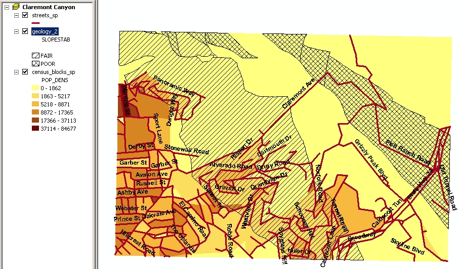
Map 1
For my first map I started with something simple and familiar, population.
Population density is a field in the census blocks layer; I represented
it with graduated colors. Now I want to try representing another field
at the same time. For example, are there a lot of people living where there's
a risk of landslides? I selected the slope stability field from the geology
layer, and represented it as categories, using different cross-hatching
for Fair and Poor categories, and nothing ("hollow") for the patches where
this field was blank. This is OK for just two or three categories, but
it wouldn't work well for a lot of categories. Finally, I added the
streets layer, made the streets thicker so they stood out, and added street
names using the Labels tab of the Layer Properties dialog box. The street
names are hard to read on top of the other lines and colors, but it makes
it easier for me to recognize where the site is if I can recognize at least
some of the street names. (Lesson: it's easy to make a map unreadable by
piling on more layers, and hard to find color combinations that work when
there's more than one layer!)
This screen capture includes the table of contents display, as a quick
and dirty version of a legend.
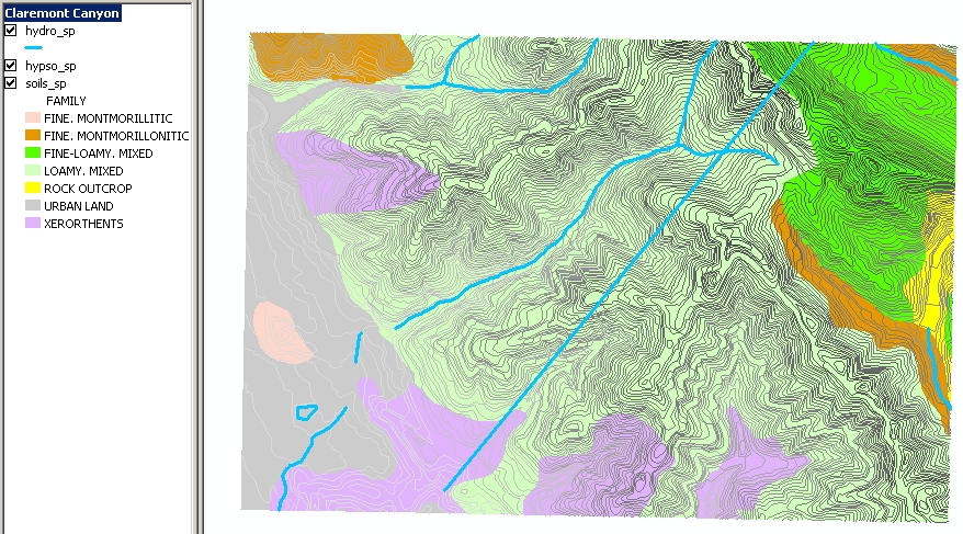
Map 2
Let's look at data that doesn't have a numerical order, like soil categories.
I color-coded the Family field of the soils layer by unique values. I don't
know what the names of soils mean, so I tried to look them up, and Google
tells me "werorthents" is a misspelling of "xerorthents"—so these
displays are a way to reveal errors in the database! I corrected
these entries using the Editor toolbar, and played with the colors so that
Fine-Loamy and Loamy soils have similar colors.
To see how soil is related to elevation, I added the hypsography
layer (fancy jargon word; it just means terrain elevation, represented
here by contour lines). There are a lot of contour lines and it's hard
to interpret them if they all look the same, so I color-coded them by the
"spot" field, which I assume means elevation of a spot on the line.
Using a spectrum of colors makes the map too confusing, so I used a range
of shades of gray. Finally, I added the hydro layer (lines of stream courses)
with thick blue lines. This is easy to read in combination with the contour
lines, since the streams run down the canyons, except for the straight
line, which (I think) is an aqueduct in a tunnel.
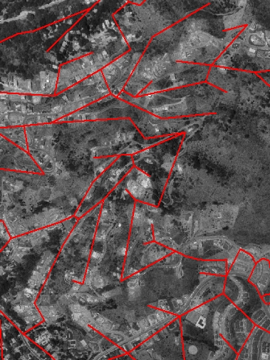
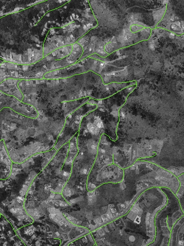
Map 3
Since there's an aerial photograph available, let's superimpose some other
data layers and see how well they match up to it. The screen captures below
show the "streets" layer in red and "roads" in green (zoomed in to show
features in the photograph more clearly). The "streets" layer (red) is
quite inaccurate! "Roads" is much better, although it's still incomplete;
more roads can be seen in the photo. I guess the "streets" data came from
a source that was much less precise, and perhaps obsolete.
And just for comparison, look at several different
maps
of Claremont Canyon provided by the Claremont Canyon Conservancy, showing
information about plant communities, fire mitigation, and land ownership.
2. Components of ArcView
-
ArcMap is used to display and analyze spatial data on maps. We can
create and edit maps, choosing which layers to include and which data fields
to represent. There are many choices of how to represent the data, such
as:
-
filling patches with graduated colors, for numerically ordered data
-
filling patches with different colors, for unordered categories
-
placing graduated symbols, pie charts, etc. on map features
-
using standardized symbols, such as highway and railroad symbols
-
putting labels on features
-
overlaying layers with transparency
Then we can get information from the map with various tools, including:
-
finding out the attributes of a point, line or region by clicking on it
-
viewing and searching the attribute table for an entire layer, which is
linked to the map, so that if you click on a feature in either the map
or the table, it is highlighted in both
-
measuring distance by pointing on the map
-
ArcCatalog is used to organize data files and view and edit metadata
(i.e., documentation about the source and data quality of the information
in a database).
-
ArcToolbox is used for geographic data processing such as changing
projections, creating TIN, and converting between formats (e.g. vector
to raster).
3. What kind of data can be used with ArcView?
-
Vector data, which is stored in shapefiles (.shp), and consists of the
coordinates of nodes and vertices which define points, lines, or polygons.
-
Raster data, which is often images such as the aerial photo and scanned
paper map in our data set.
-
Attribute tables, which record all the non-spatial data associated with
the features defined in a shapefile, such as the soil characteristics (soil
type, pH, moisture, etc.) of each region on the soil map.
TIN (Triangulated Irregular Network), which represents elevation recorded
at irregularly spaced points.